Website proposal · Grand Voyages
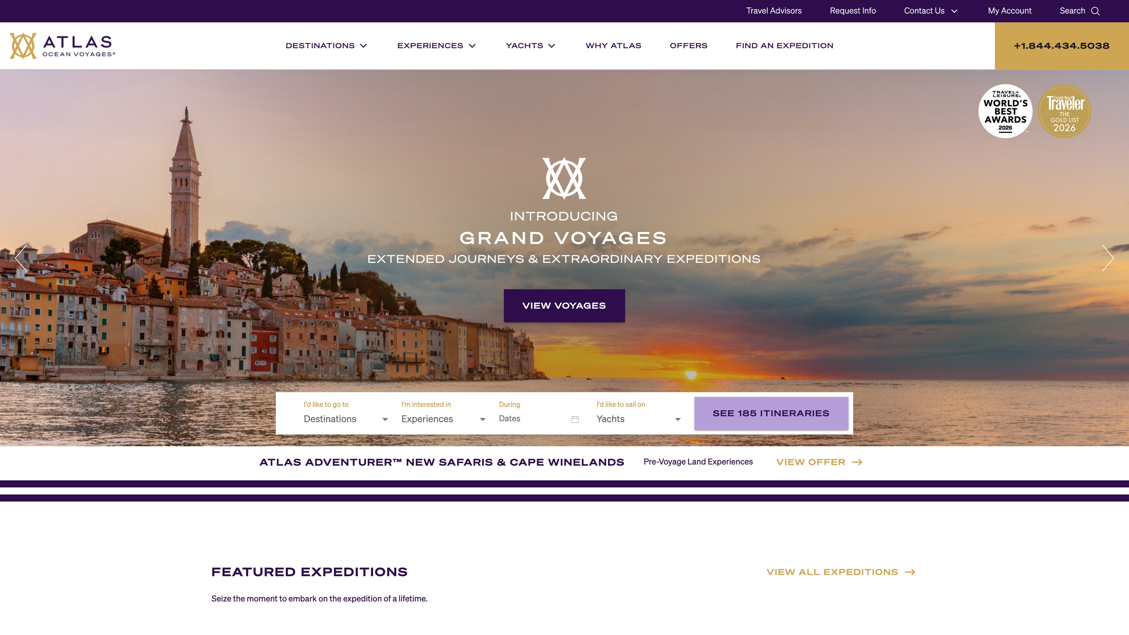
Grand Voyages homepage hero
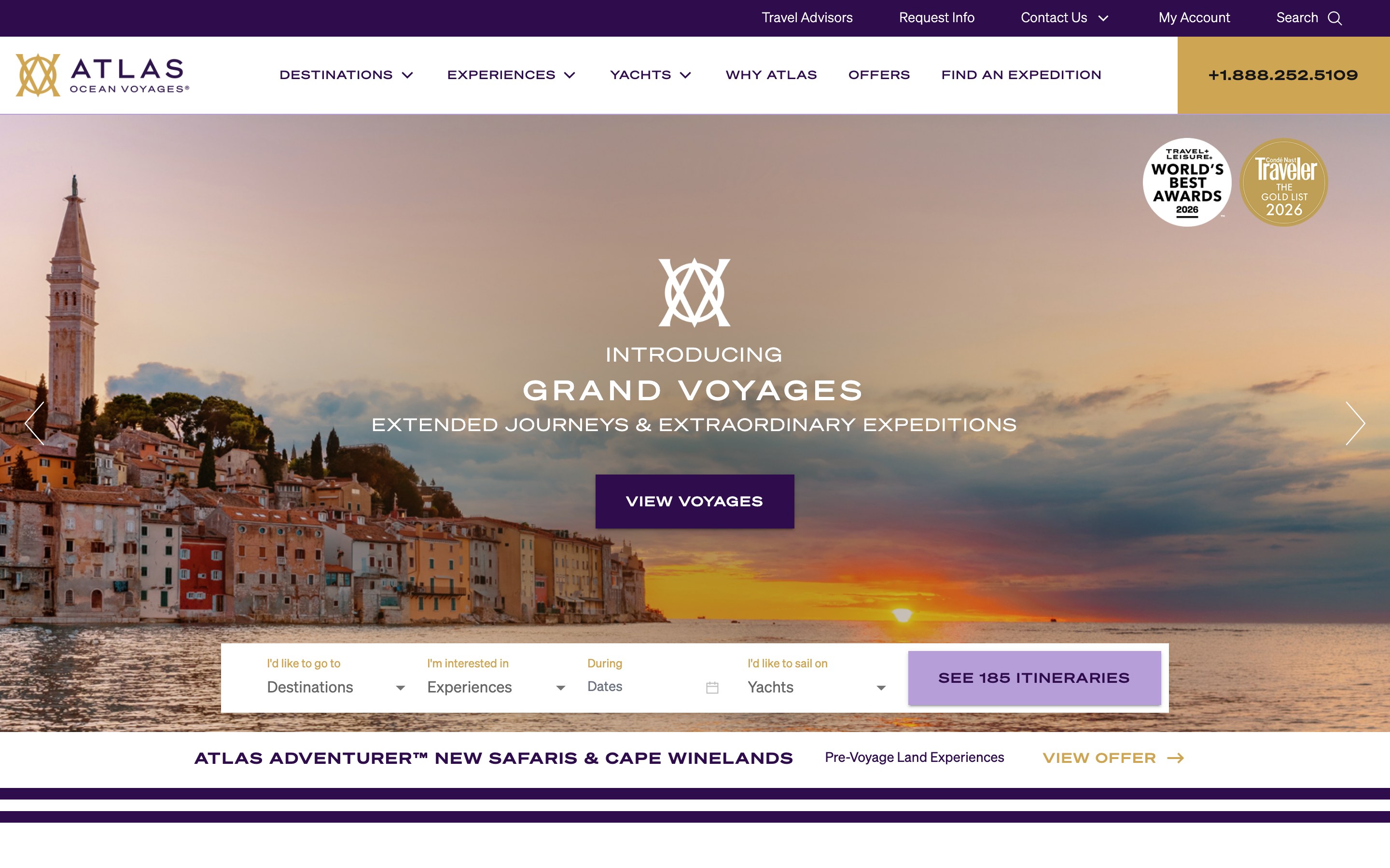
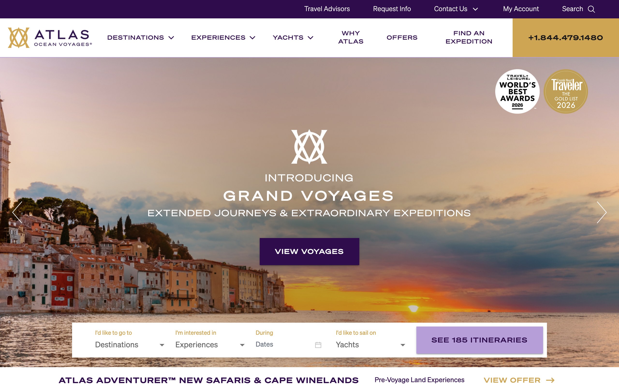
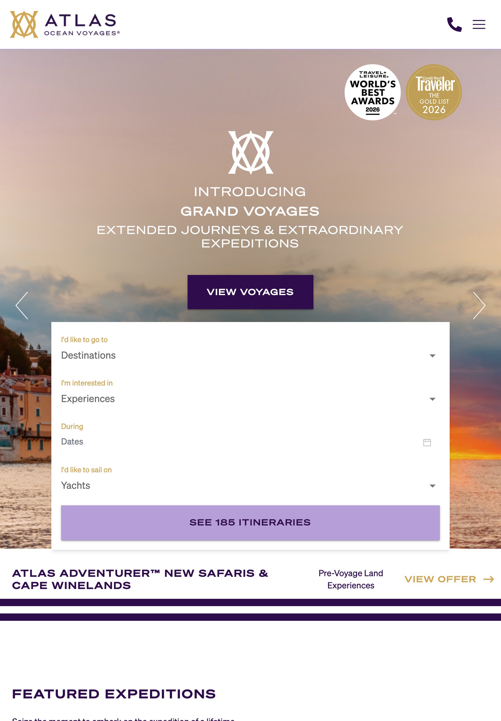
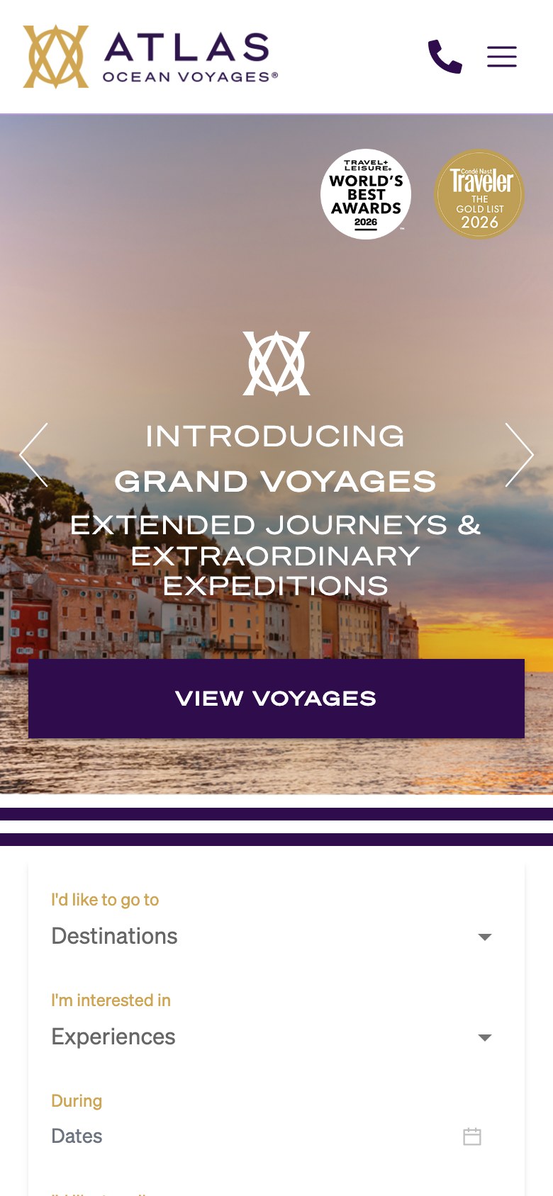
The live atlasoceanvoyages.com homepage with each image placed in the first hero slide, shown at five screen widths. Only the image and the hero copy were changed. The overlay shading, badges, arrows, button and search bar are the live site's own.
Desktop, laptop and tablet
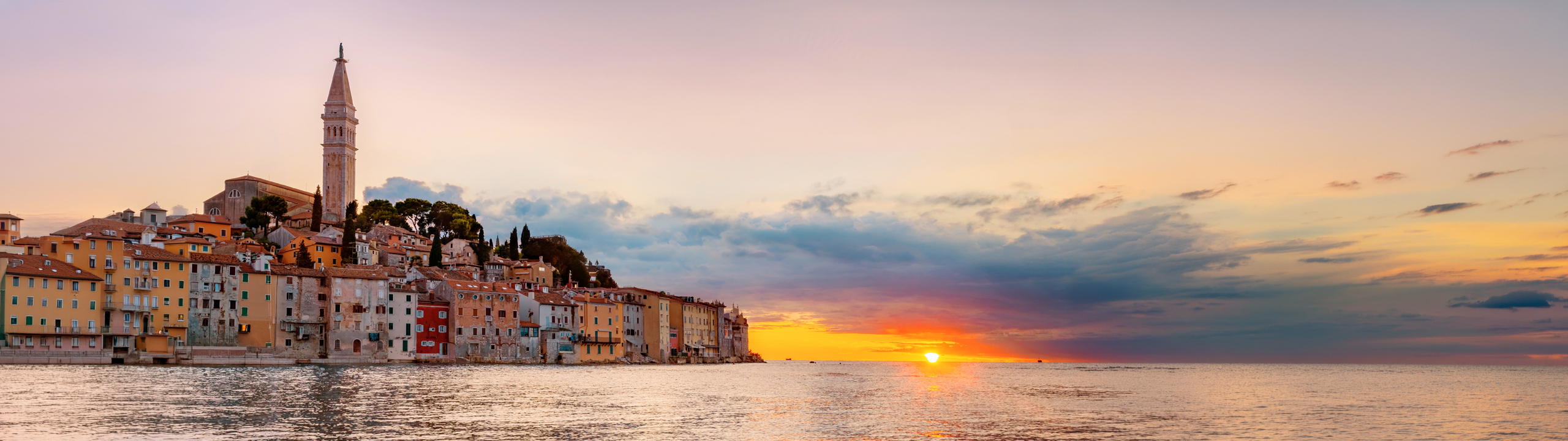
2560 × 720 px
- The hero is always 640 px tall and crops from the center.
- Always visible on a 1280 laptop: the center 1440 × 720 of the file. Keep the subject inside it.
- The copy sits in the middle; the search bar covers the bottom 90 px; badges sit top right.
- Tablets use this same file as a narrow vertical slice from the center.
Mobile
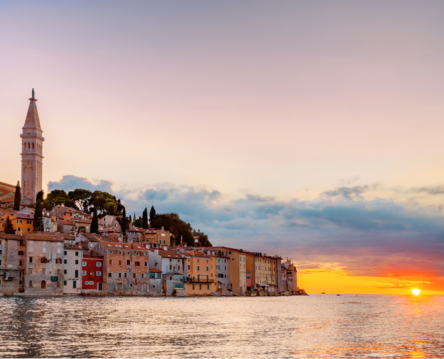
890 × 720 px
- A separate file, shown 390 px wide and 480 to 504 px tall.
- Always visible: about the center 560 × 720 of the file.
- The copy and button cover most of it, so the subject reads best in the upper half.
Option A
A · Rovinj
Files: desktop 2560 × 720 · mobile 890 × 720